When it comes to graphics, art style beats realism every time
There seems to have been a lot of talk over graphics, art style and visual fidelity of late — some of it more rational than others.

On the one end of the spectrum, there was a big fanboy argument on Twitter the other day over whether or not the individually modelled fruit in The Last Of Us Part 2 meant that PlayStation was better than Xbox (I really wish I was making this up), while at the other, we’ve seen articles from Kotaku and PC Gamer showing heavily modded Breath of the Wild and Skyrim respectively, accompanied by gushing praise as to how amazing they supposedly looked.
I mean, sure, they’re technically impressive — as are the big-budget, crunch-driven triple-A titles that Sony’s various studios churn out on a regular basis — but in adopting all that technical wizardry, they lose something. They lose a lot, in fact; they lose a sense of soul, of individual identity, of style.
And that’s why I’ll always prefer games that eschew being the most technically impressive things you’ll ever see in favour of being instantly, immediately recognisable. Particularly if you don’t have to spend hours faffing with mods and tinkering with graphics settings to get them looking their “best”.
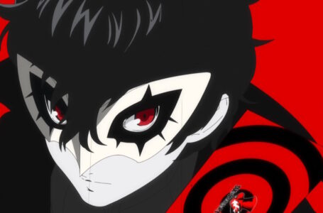
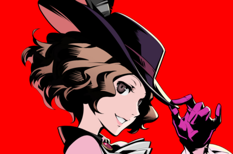
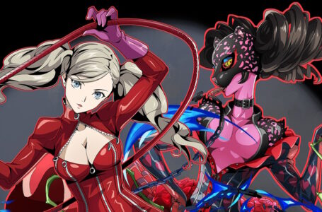
For a lot of people, the most obviously striking example of this is Atlus’ Persona 5 and its various spinoffs. Atlus had been making a real effort to give the series a distinct sense of visual flair and its own art style ever since 2006’s Persona 3 on PlayStation 2, with stylised menu transitions, manga-style visual onomatopoeia and dramatic cutaways.
With each new installment, Persona took things a little further in the style stakes. Persona 3’s muted blues and silhouette-adorned menus gave way to the vibrant yellows and colour stripes of Persona 4, and eventually the exaggerated, bombastic art style of Persona 5 — a game which felt like Atlus had finally nailed what they had been going for all these years.
Was it realistic? Absolutely not — but you sure as hell knew that you were looking at Persona 5 the moment you saw a screenshot. And best of all, it didn’t require 500 mods and a monster PC to create that distinctive sense of visual identity and unique art style.
There are tons of other examples, too. I remember a while back when I played through Atelier Lulua: The Scion of Arland, I sent an artist friend of mine this screenshot:
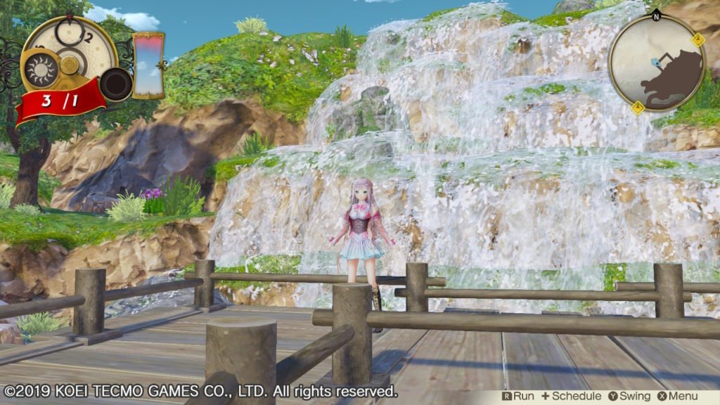
His immediate reaction was one of delight, not because it was technically impressive — in the grand scheme of things, it’s not — but because it’s a game that understands the vibe it wants to create with its visuals and, through the use of colour, lighting, shading and overall sense of art style, successfully creates that feeling in players’ minds.
Not only does Atelier Lulua have its own distinct visual identity thanks to character design and interface elements, it also fits in with the broader series that it is part of through elements it has chosen to keep consistent with other installments. That sense of visual coherence and consistency really excited my friend as an artist.
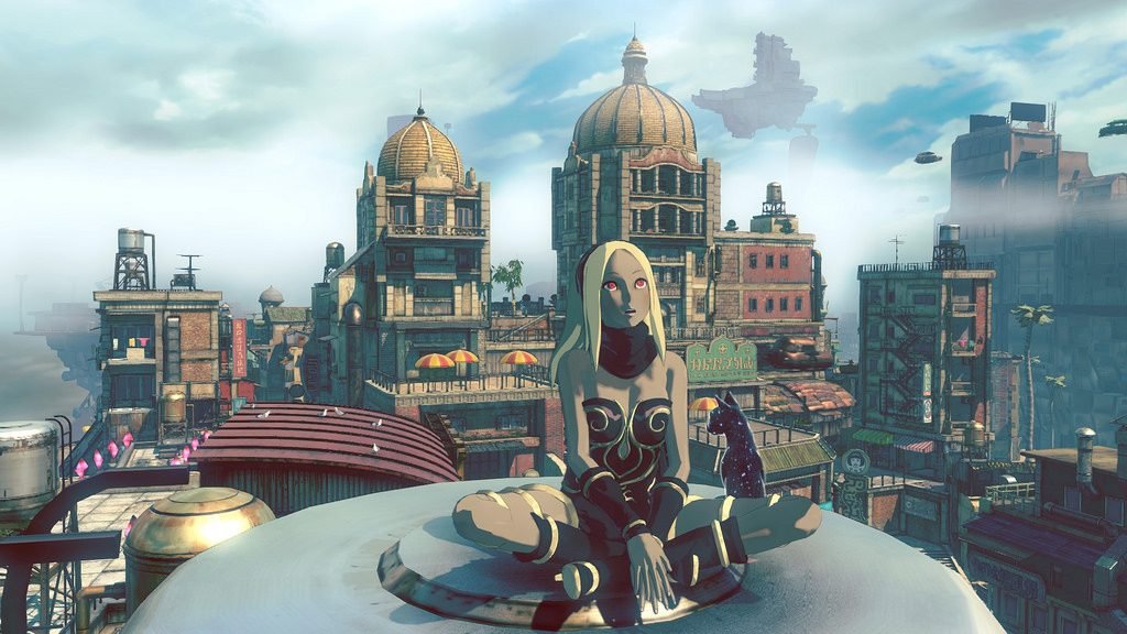
Or what about Sony’s oft-mourned Gravity Rush series, a pair of games that were explicitly inspired by the Franco-Belgian artists of the bandes dessinées tradition — particularly an individual known as Jean Giraud, or Mœbius.
Gravity Rush’s blend of detailed but often fairly flatly coloured backgrounds with enormously expressive characters that blend elements of both anime and western comic traditions gives it a fantastic sense of visual identity — and, again, without requiring either mods or powerful graphics hardware to pull this off.
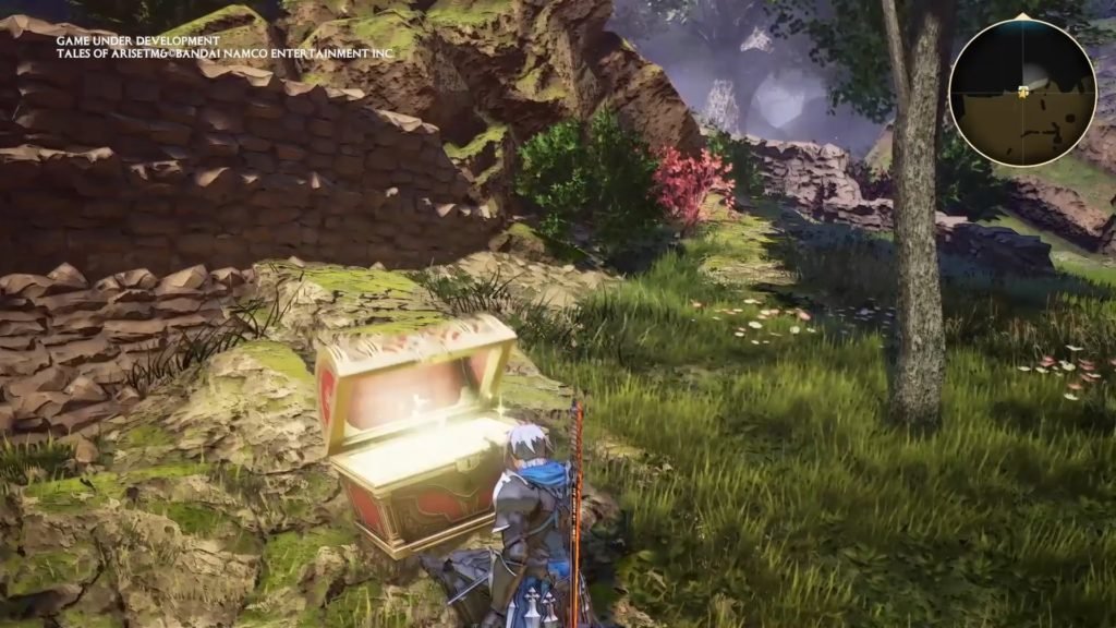
Bandai Namco’s upcoming Tales of Arise — which we’ll have a full preview of later today — also goes for a similar approach to this; in fact, its general sense of visual presentation has a lot in common with Gravity Rush, particularly with regard to how many of its backdrops make use of flat, pale colours with strongly contrasting detail lines.
The interesting thing about Tales of Arise is that it feels like a polished game with a big budget — it’s definitely a strong contrast to the work of much smaller RPG developers like Compile Heart in terms of scope, ambition and general technical proficiency — but it still manages to maintain that all-important sense of style. It has individuality; it knows what sort of vibe it wants to create, and it does everything it can to accomplish it.
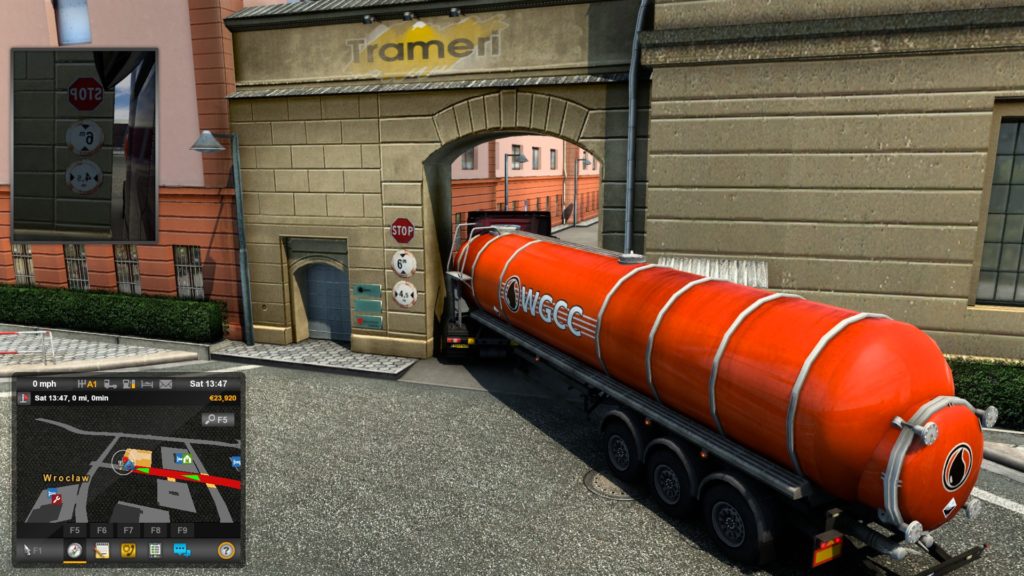
There’s a time and a place for realism, of course. I doubt I’d enjoy games like Euro Truck Simulator 2, Microsoft Flight Simulator and Bus Simulator 18 as much if they took a more stylised approach, because the whole intention of those games is to simulate reality. (Although, thinking about it, “Comic Book City Bus Driver” does sound kind of fun.)
And likewise there’s an argument to be made for the grittier side of narrative games to go for a more realistic art style and feel for a sense of “authenticity”.
But then I think back to how many super-stylish visual novels and RPGs I’ve played, how many anime I’ve watched and how many manga I’ve read — and how all their narratives manage to feel completely authentic and emotionally engaging without making any sort of attempt to be even a little bit realistic from an art style perspective. And I can’t help but think that if we’re going to use video games as, among other things, a means of escaping grim reality — we might as well go the whole hog, huh?
Join The Discussion
Rice Digital Discord
Rice Digital Twitter
Rice Digital Facebook
Or write us a letter for the Rice Digital Friday Letters Page by clicking here!
Disclosure: Some links in this article may be affiliate links, which means we may earn a small commission if you make a purchase after clicking on them. This is at no additional cost to you and helps support Rice Digital!


- Letter from the Editor: passing the torch - June 30, 2023
- Super Woden GP 2 is looking promising - June 30, 2023
- Inti Creates is making a 32 bit-style Love Live action platformer - June 26, 2023